Journaler

A safe haven for your thoughts and a daily mood tracker
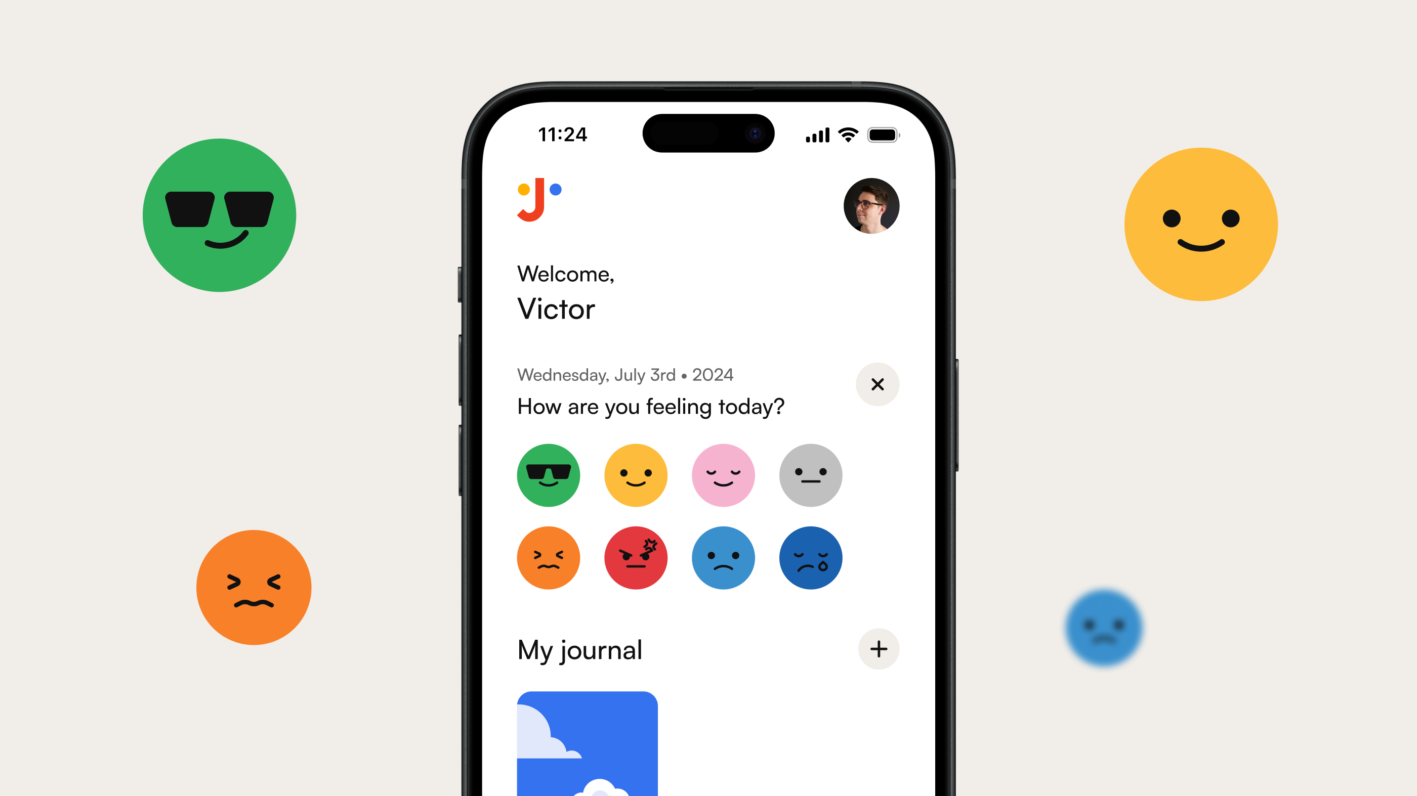
When the pandemic hit in 2020, I fell into a dark place mentally. The regular anxiety I had became a bigger issue that I had no idea how to deal with. In 2022, I started writing in a journaling app on a daily basis, and it helped me take what was in my head and express it in words, even if I was the only one reading it. Along with therapy and many other things, daily journaling helped me get through life, and because of that, I decided to create a concept project that is close to my heart.
Year
2024
Scope of work
User Interface
User Experience
Mobile App
Animated Prototype
Icon Design
Duration
2 months
Basic idea and purpose
Just like I said at the beginning of this case, the whole idea came from the pandemic, anxiety, daily journaling, and therapy. I decided to create this project for the simple purpose of training my abilities as a designer and to have something new to share with my network.

I'm always busy with client work, and most of my projects take a lot of time to complete. To keep this portfolio updated, I create these concept projects from time to time.

Journaler is a safe haven for your thoughts, meaning no AI will read what you write to train some random algorithm. Everything here is personal and also serves as a daily mood tracker to see how you are doing over days, months, and years.
What now? Sitemap and wireframe? Yes, let's go!
Like every project I work on, there are always four steps, just like the ones you can read about on my services page here. I start with discovery to understand things, then move to wireframing to create all the user flows and user journeys so my project is in an amazing place and ready for UI.

It might sound simpler than it actually is, but I don't think I need to complicate things just to sound smarter. Creating apps is hard work and very time-consuming, so to operate at a high level of quality, it takes time, effort, and a whole bunch of elbow grease.

Easter egg:
The first app I designed was a redesign of the dead app "Vine" for Windows Phone.
Primary colors, a sea of screens and a hell of a great time
I'm always thinking that the current project I'm working on is the best until it's done, and then I move on to the next thing. For the Journaler project, I had an amazing time designing everything I wanted to have here: all the wireframes, screens, icons, buttons, and animations.

I love creating something bigger from time to time, like this project, to show the full extent of what I'm capable of doing for new clients. All the work you see here was done by me with a smile on my face and a podcast on my headphones.

What more can I say about the designs below?
Well, the wireframes were done and after I was happy with the ux flows I moved on to the UI.
Logo, colors, type, animations and iconography
Since this project was a concept, I wanted to have my hand in everything I designed, including the logo. Even though I'm not a brand designer, majoring in graphic design in college was really handy when creating a logo. I've been working in digital design for over 16 years, but my design heroes are all graphic designers.

For the colors, I used primary colors to match our primary emotions when dealing with things on this app. I love how the little symbol with the "J" looks like a face.

Another thing I enjoyed working on was all the little animations with the emotions. I don't consider myself an animator, but I had a great (and sometimes stressful) time working on those.

I used a lot of references to make them show what it's like to be joyful, happy, calm, and so on.

If you are reading this, here's a little easter egg for you:
Back in the '90s, I wanted to be an anime animator because of all the old animes I used to watch with my brother. Evangelion was a huge inspiration, and it's crazy to think back then I was already in love with art.
Design components as it's best
I always create a style guide when working on a design project to organize everything I have done. This includes logos, fonts, icons, and many other design components.

Organization is a huge part of everything I do for my own projects and client work. It doesn't matter if it's a concept project or a paying client; work is work, and all are the same to me in terms of quality and deliverables.

"After the 2020 pandemic, I started dealing with a lot of anxiety, like many people. Along with therapy and many other things I tried to feel good again, I began sharing my thoughts in a journal. I created Journaler to be something I would love to use on a daily basis."

Victor Berbel
UI/UX Designer, victorberbel.work
Some articles you may enjoy reading

Dribbble

Playground for all sorts of projects

Journaler

UI/UX – Mobile App
2024

Zoh

UI/UX – E-Commerce
2024

Greco Gum

UI/UX – E-Commerce
2023

Poesial

UI/UX – E-Commerce
2022

Booksprout (SaaS)

UI/UX – SaaS Dashboard
2022

Nobe (Saas)

UI/UX – SaaS Dashboard
2022

Nobe

UI/UX – Website
2021

InvestyClub

UI/UX – Mobile App
2021

Awari

UI/UX – Website
2021

Netflix

UI/UX – Concept App
2021

Booksprout

UI/UX – Website
2020

Moments

UI/UX – Concept App
2020

HungryButton

UI/UX – Mobile App
2019

Ordine

UI/UX – Concept SaaS Dashboard
2018

OLX

UI/UX – Redesign Concept App
2016