Poesial

High-end beauty products for the Singaporean market
The beauty market in Singapore generated over 174 million dollars ins 2020 and with that huge amount of money, there are a lot of new opportunities for new business. Poesial was created to bring high-end beauty products to that market.

Go visit: www.poesial.sg
Year
2022
Scope of work
User Interface
User Experience
Ecommerce
Icon Design
Duration
3 months
Let's get started
On the kick-off call, I remember asking Poesial's Co-Founder Ling many questions about the company goals, what they had in mind in terms of visuals and why they are different from the other e-commerce that is out there in Singapore.

Poesial goal is to bring only selected high-end beauty products to the Singaporean market and have a close connection with the community of people who are buying those products.

There are many e-commerces out there and creating something new and refreshing while maintaining the usability was an amazing challenge to tackle.
Let's get started
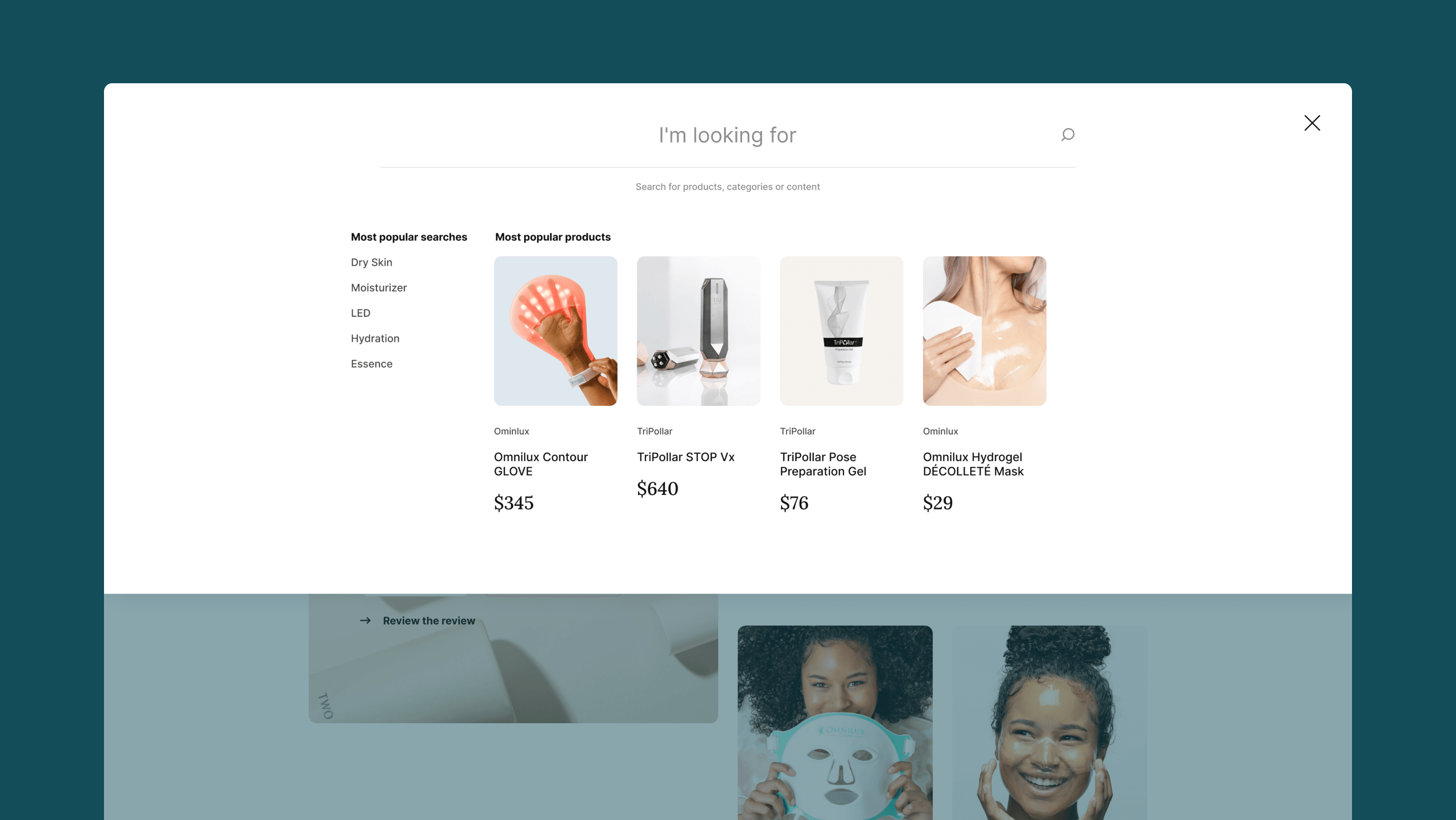
The foundation of every project is a well-organized sitemap to map all the screens and flows that will have to be created. For Poesial wasn't any different, the sitemap can be small but that whole project was no joke with all the requirements the client asked me to include like the ability to buy without having an account.

When we are talking about e-commerce you can't have one without inner sections like My Account, but for this specific project Ling only asked me to design the outside screens.
Let's get some wireframes done
To get started with the wireframe, Ling shared a well-structured document with all the content I had to put on the screens. The wireframe took a few weeks to get done with all the back and forth we had to do so all the screens and flows were perfect to move to the UI.

Poesial is based in Singapore and I'm based in Brazil, and being 11 hours behind in time wasn't a problem. I worked on the project in the afternoon and waited for feedback the next morning. For the things that weren't easy to understand via text, we relied on Loom to record videos and used Zoom for scheduled calls.

Ecommerce is a type of project that I don't usually do so I had to do some research and look at some references to solve some requirements Ling had with this project like the ability to buy without an account.

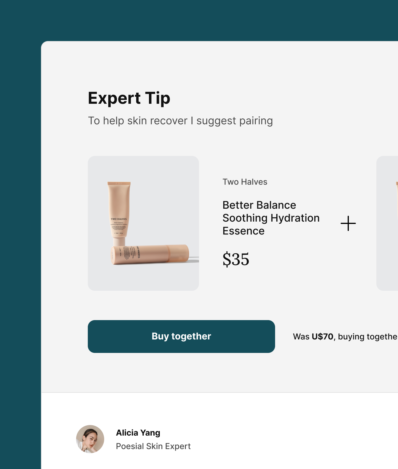
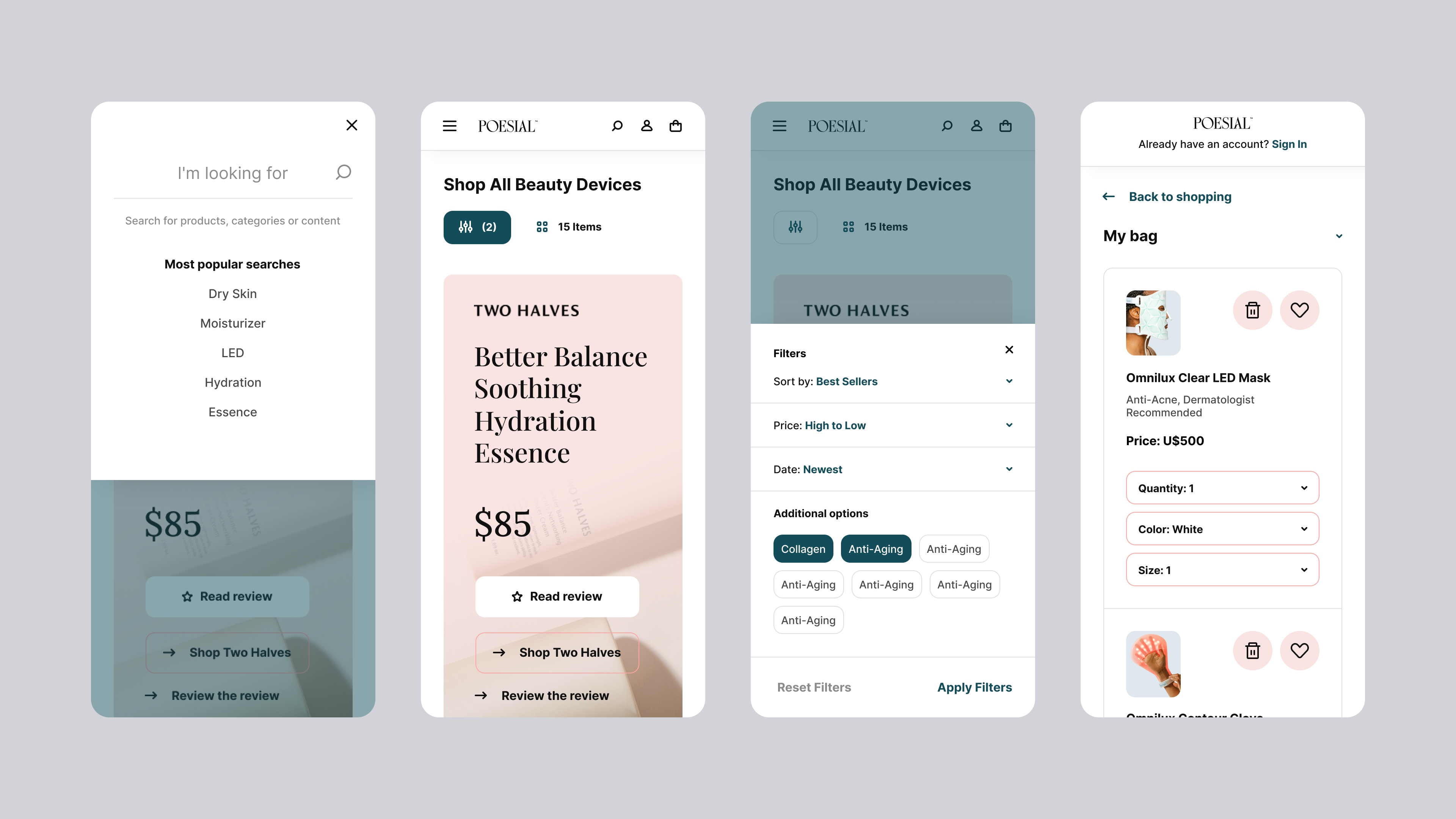
Poesial is the type of store that sell expensive products and clients are buying 2-4 at a time, with that insight to solve I had to restructure the shopping cart in a way that look easy to use and looked well designed at the same time.
The beauty and the UI
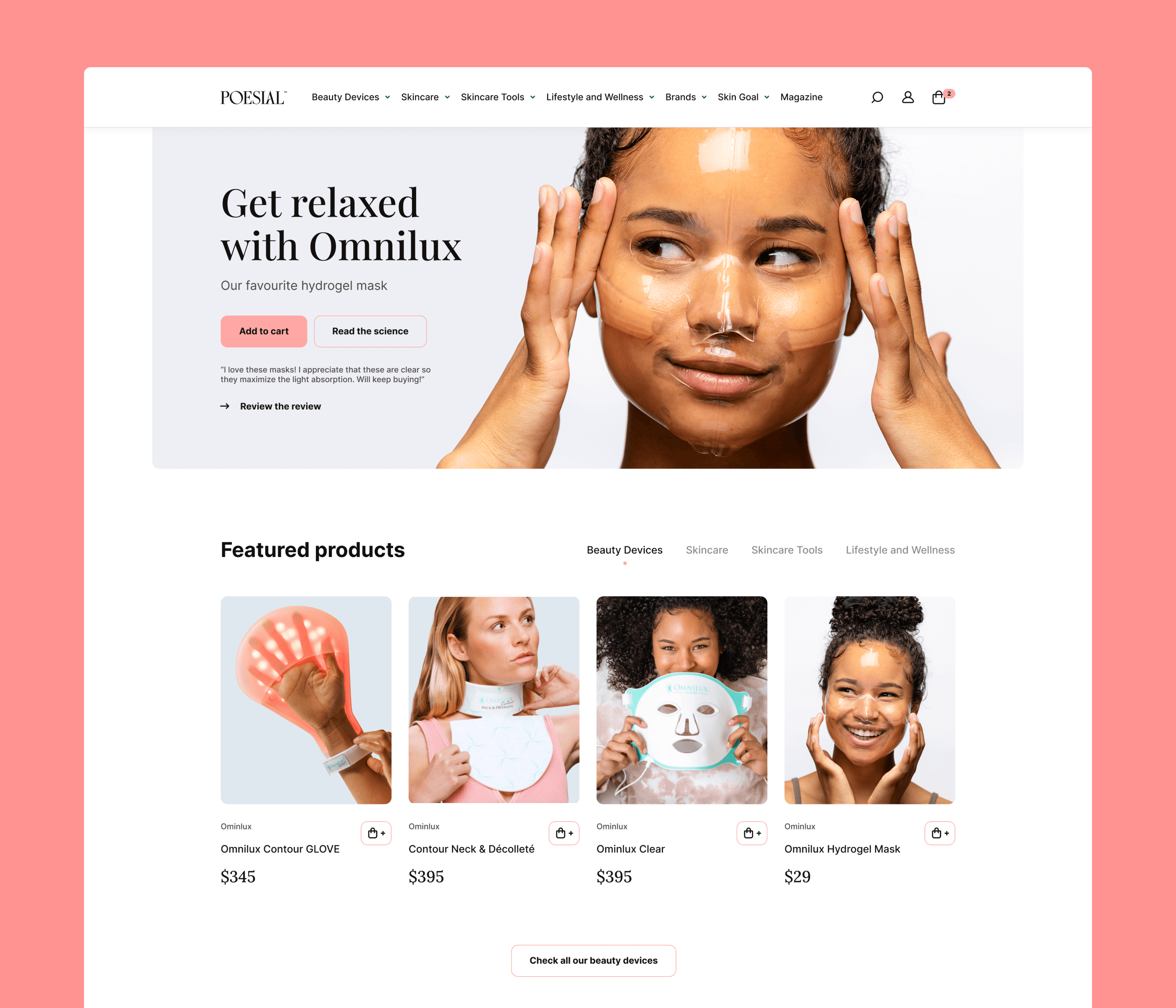
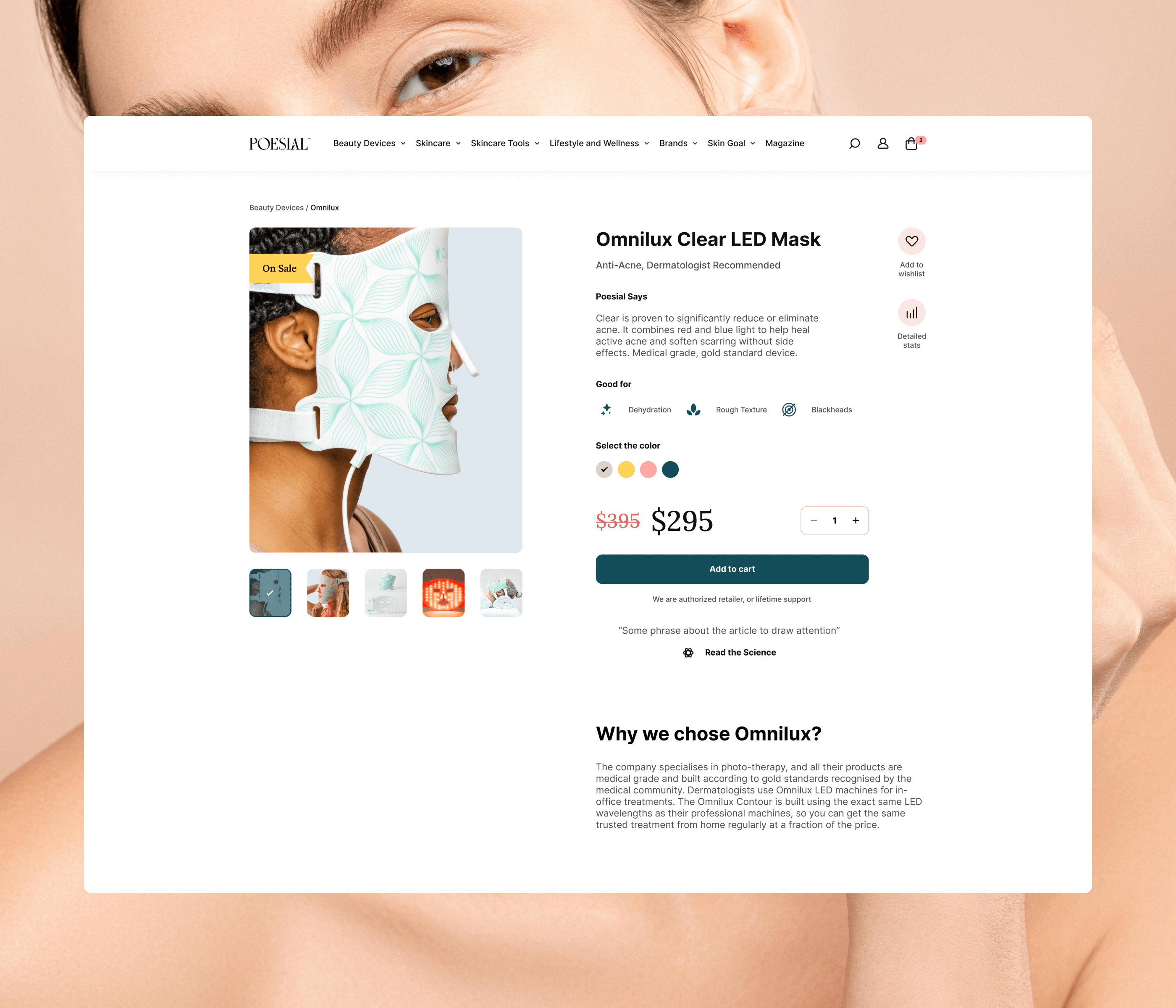
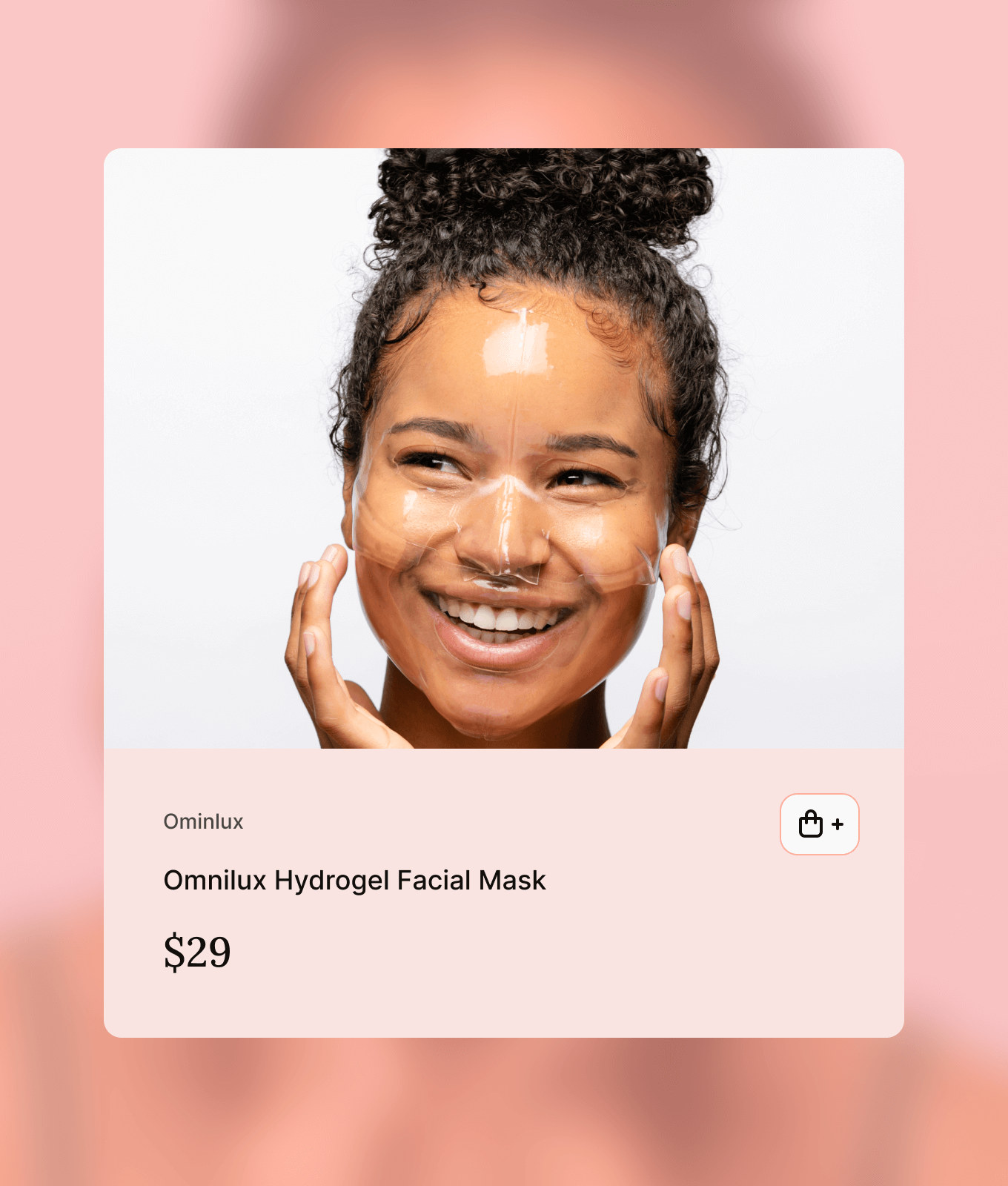
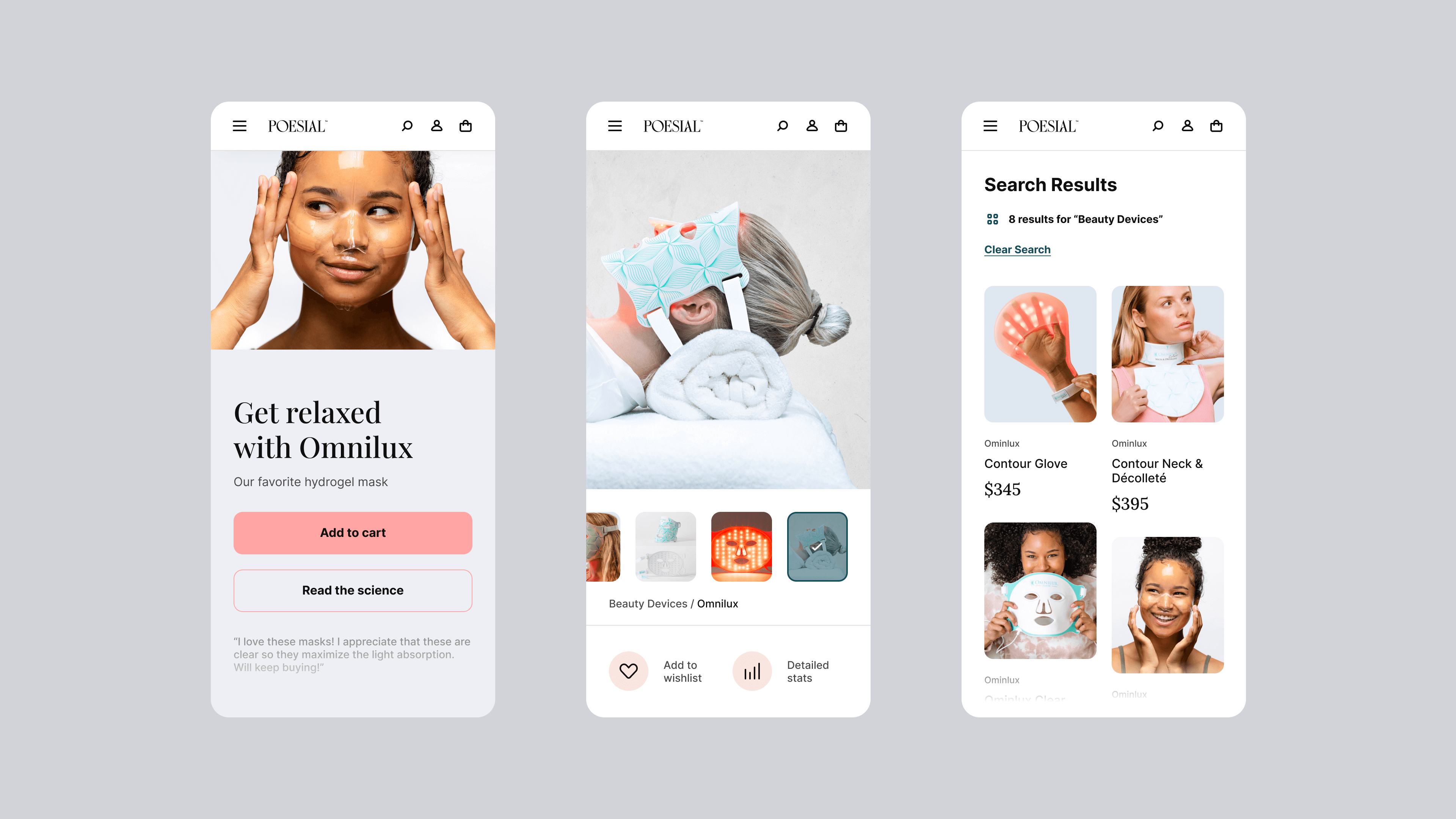
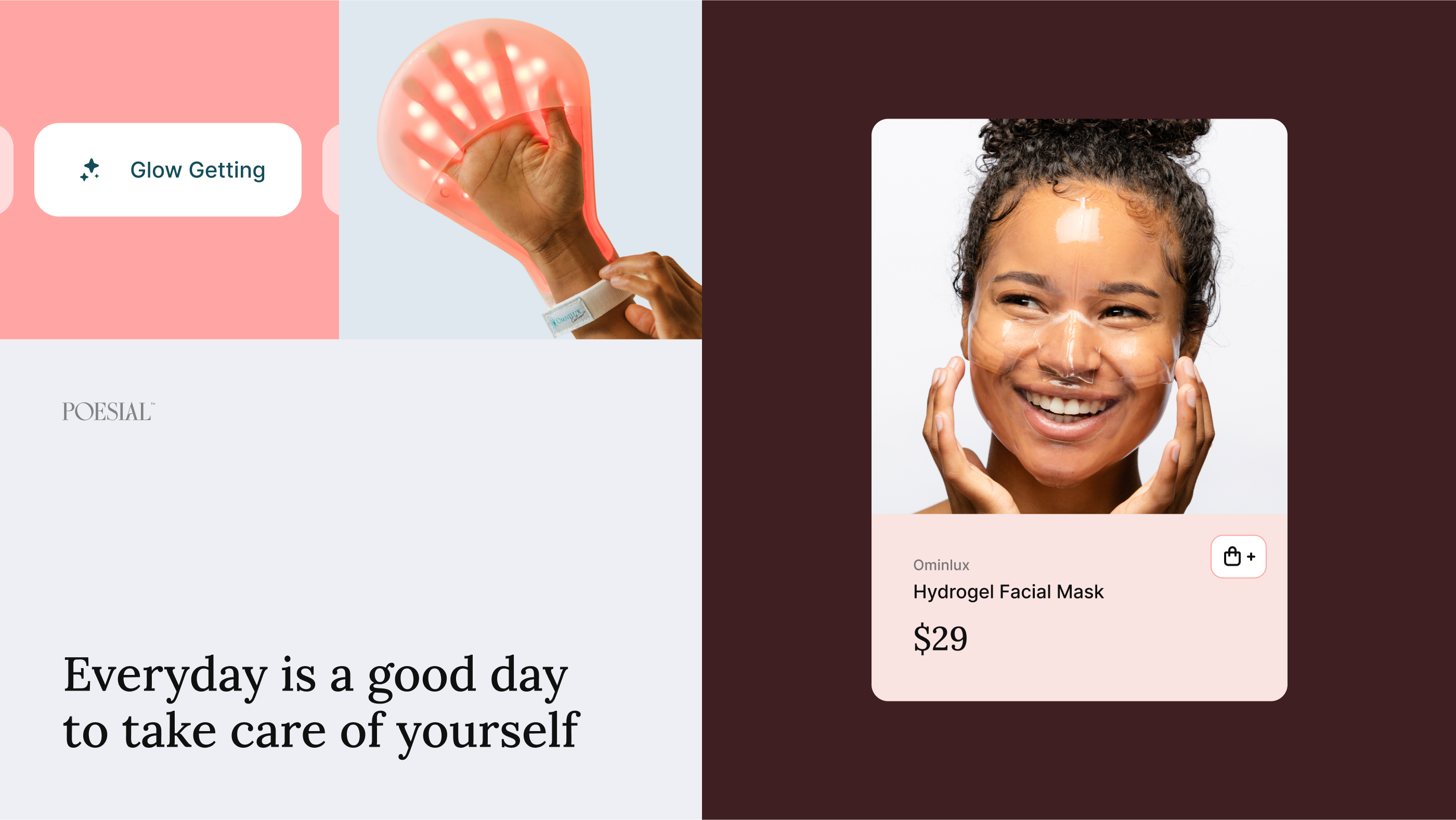
I used a lot of white space to make the products stand out as much as possible.
For this project the main goal of each page is to delight and sell high-end beauty products so the design had to be the supporting star on every page.

I spent a lot of time on the wireframes to get all the content blocks and user flows just right so when I get to the UI it was a lot easier and faster to add colors, photos and custom icons.
Visuals, colors and fonts
At the beginning of the project, they only had a logo and simple color palette created by Helena Stretovych. I used the logo style to expand the color palette and have a wide variety of colors to use across the project.

I also expanded the text and chose 3 type faces to be used as titles, text and pricing.
I don't usually use more than 1 typeface per project but on this case I felt that was necessary so the text would be aligned with the logo Helena made.
Icons, icons and more icons
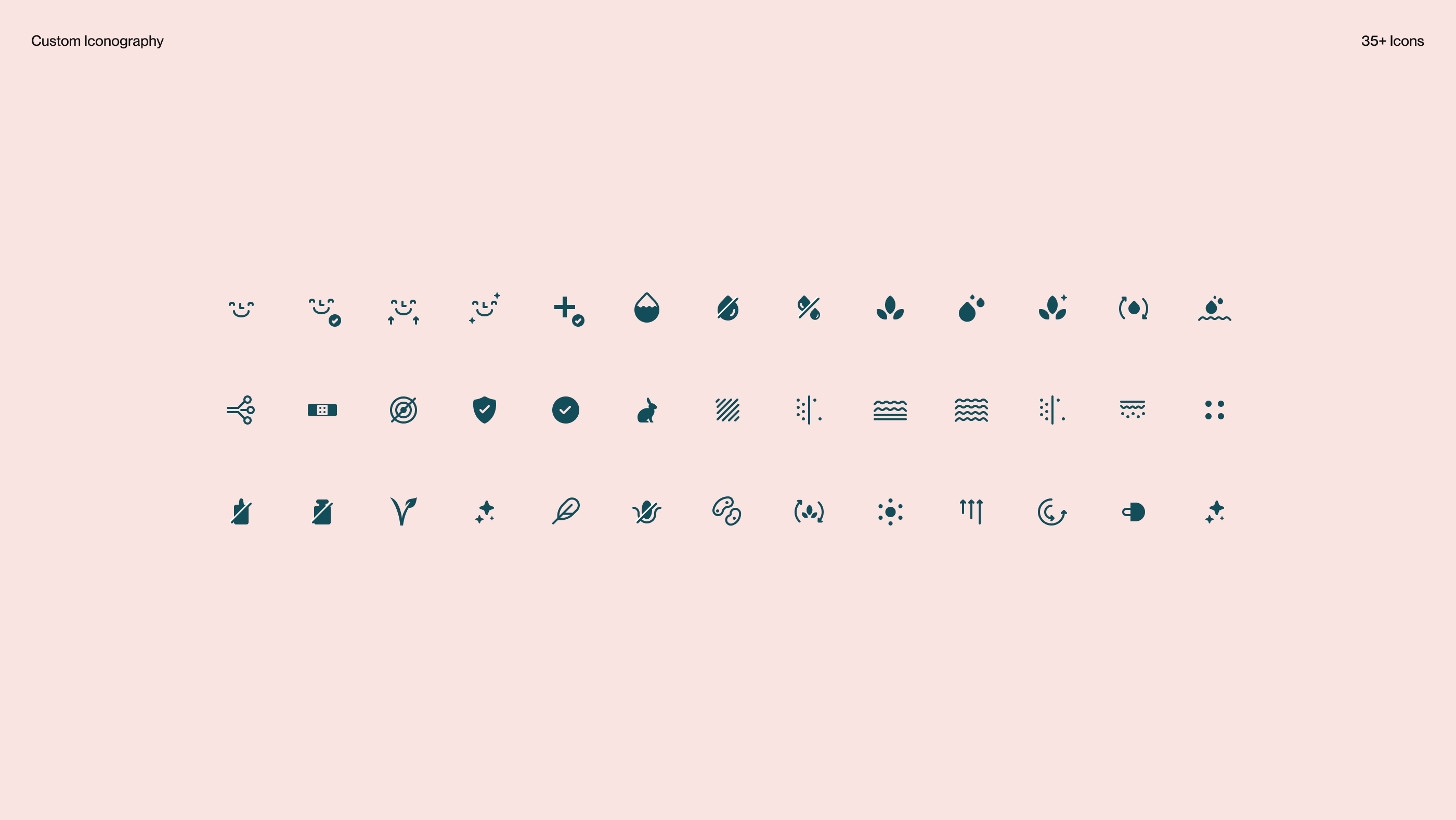
For every project that I work on I'm always creating custom icons and for Poesial wasn't any different. I created over 50 custom icons to identify many states, skin types and other content across the project.

I used a 2px stroke on all the icons so they are all cohesive and part of the same pack.
There's a beauty in designing custom icons that you can't get when picking them from an icon pack and the custom aspect makes them tailored specific from that client you originally created.
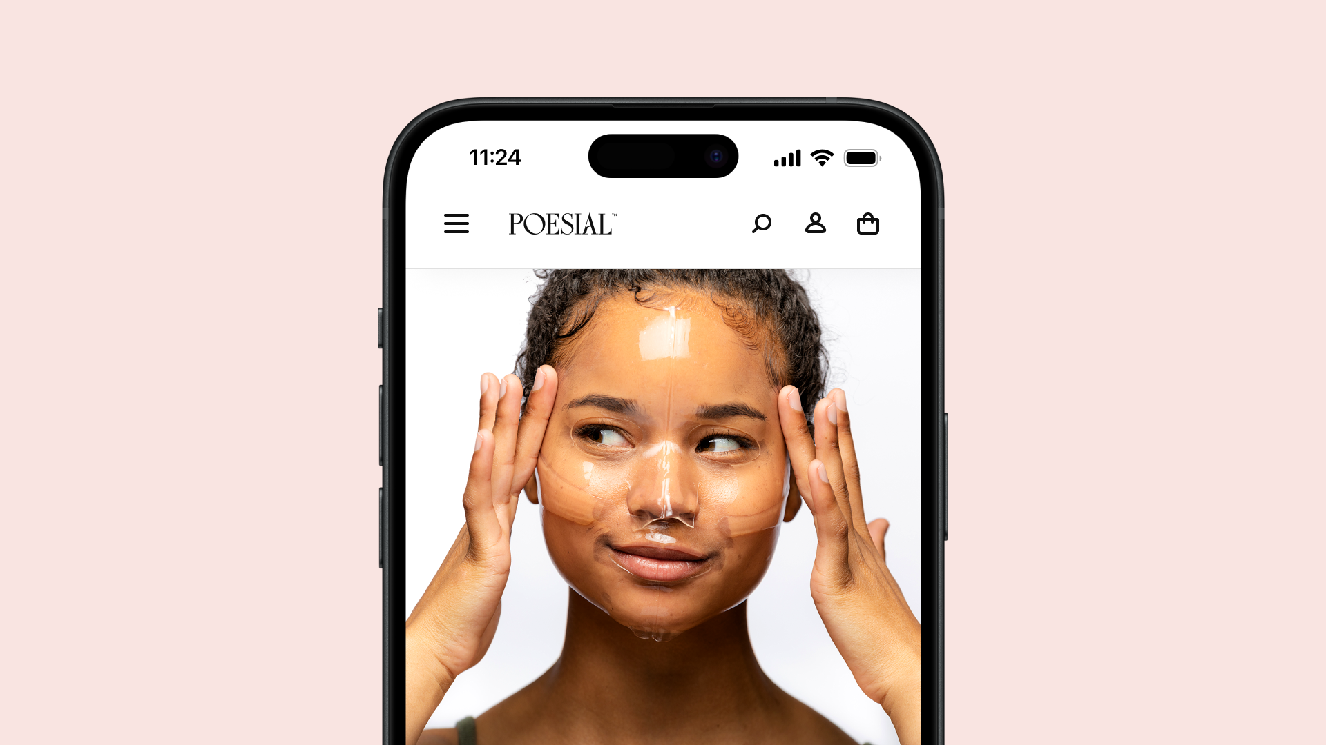
Shop on the go
Depending on the features and functionalities of a project it can be challenging to convert everything to mobile without losing any important aspects of usability. For this project, I had to make some compromises because of the long content pages and at the same time being easy to scroll and find the content the user needs.

The hardest part of this whole experience was to make the shopping cart as easy as possible to use when buying new products.
A style guide to keep everything organized
Since this is a big project a style guide was a no-brainer to be created so the styles are all organized, and scalable and I don't need to create the same button over and over again. The style guide was created using Figma which allowed me to easily update when I had to and to give the client the ability to scale this project even if they decide to hire another designer to work on it.

“A good designer gives you what you want. Victor gave me what I wanted and what I did not realize I wanted until I saw what he'd created for Poesial. Victor's creativity is a force to be reckoned with - don't go to him if you simply want a designer who follows all your rules because he's more than that. Victor is organized, punctual, and reliable. We worked on different timezones but communication was incredibly smooth.”

Ling Xin Sia
Co-Founder, Poesial
Some articles you may enjoy reading

Dribbble

Playground for all sorts of projects

Journaler

UI/UX – Mobile App
2024

Zoh

UI/UX – E-Commerce
2024

Greco Gum

UI/UX – E-Commerce
2023

Poesial

UI/UX – E-Commerce
2022

Booksprout (SaaS)

UI/UX – SaaS Dashboard
2022

Nobe (Saas)

UI/UX – SaaS Dashboard
2022

Nobe

UI/UX – Website
2021

InvestyClub

UI/UX – Mobile App
2021

Awari

UI/UX – Website
2021

Netflix

UI/UX – Concept App
2021

Booksprout

UI/UX – Website
2020

Moments

UI/UX – Concept App
2020

HungryButton

UI/UX – Mobile App
2019

Ordine

UI/UX – Concept SaaS Dashboard
2018

OLX

UI/UX – Redesign Concept App
2016