Nobe

Live without worries while fulfilling your tax obligations

After living in Estonia for 3 years, Thomas and Ernesto realized how hard was to handle any bureaucracy every time they went back to their countries in Brazil and Mexico. They had to do a long process of printing a bunch of documents, queue in line for 5 hours, and wait up to 7 hours to get it all done. With that in mind, Nobe was created with the mission to make taxes and accounting an easy process.
Year
2021
Scope of work
User Interface
User Experience
Website
Icon Design
Duration
~ 3 months
Let's start with the basics
After two rounds of funding, it was time to work on a new website and make it look what Thomas and Ernesto had in their heads. The website below was the first version they had to get the business started but not what they wanted to be viewed as.

There was quite a challenge to solve problems and come up with something new and exciting so the company can grow and be viewed as a legit business. I remember having the first call with Thomas when he said "I don't think our website looks legit and fun, and that's exactly what I want to change".
Problem
Solution
The old website only had two colors, white and blue so everything felt bland and boring.
An improved color palette and a variety of new components were added to give a sense of fun and excitement to the website.
At a first glance was hard to understand what the company does.
The whole communication was changed to be simple enough to understand what the company does.
There was no information about pricing nor even how the product works.
A pricing page was added with a calculator so the user can calculate themselves how much they will pay for the service.
The old website used generic stock icons.
New icons were custom made.
The old website did not send the right message of a trustworthy company.
Along with a design and social proof components the new website looks like a trustworthy business and ready to onboard new clients.
Small scope doesn't mean easy
The Nobe team had a small scope of pages but no content at all to get started. So we started listing all the screens we had to do for this project and defining all the goals for each page.
The foundation of any project
With the goals of each page approved in hand, it was time to start creating basic wireframes to set the foundation for all the content blocks we will need to send to the copywriter. Surprisingly enough it wasn't a whole lot of back and forth with the client to get final approval on the wireframe.
A sexy new design
We all know that when it comes to accounting, it's not fun nor even an exciting thing to do, but we all got to do it sometime during the year or even multiple times.

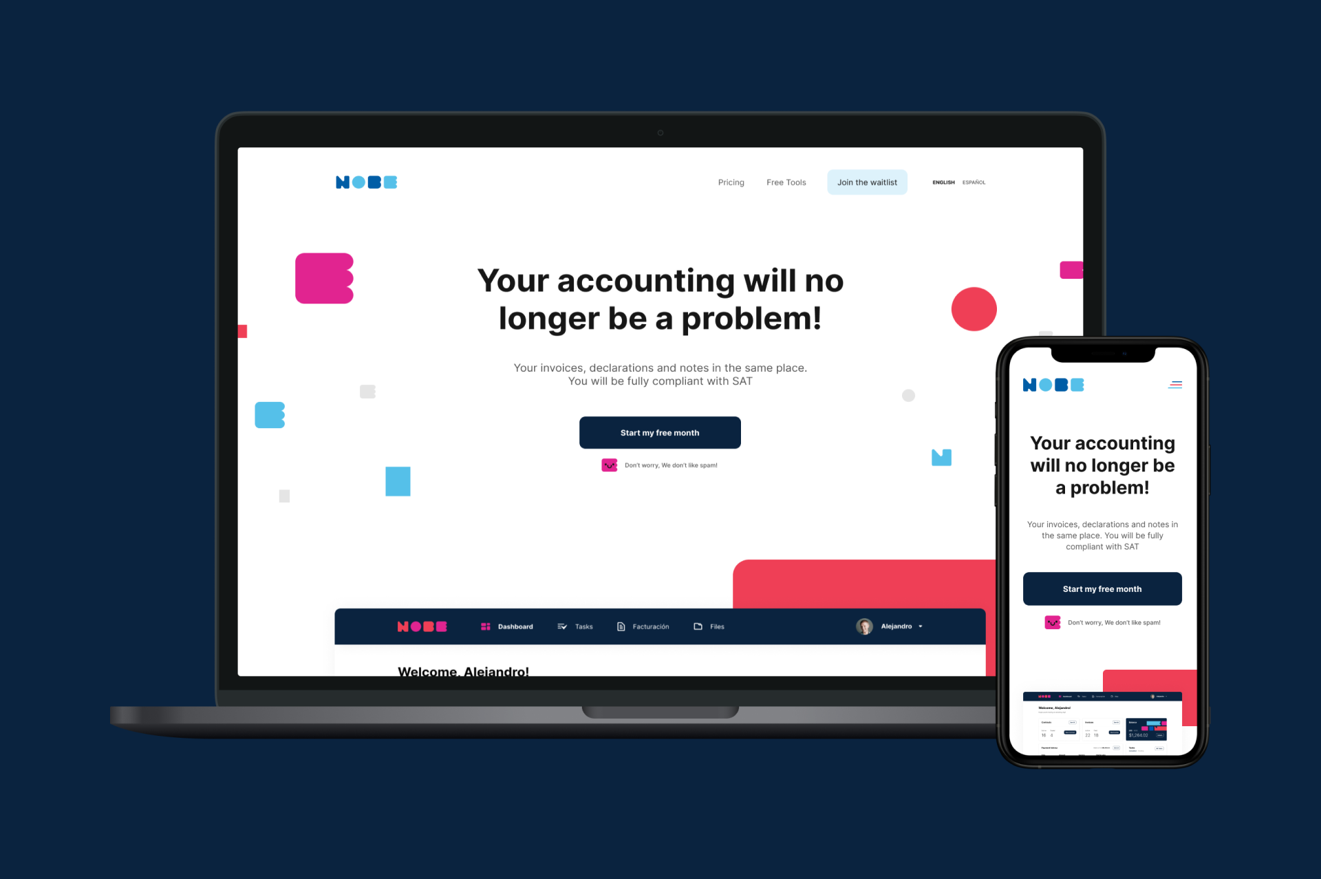
One of the goals for the new website was to be alive, colorful, and as easy as child's play.

The colored blocks on the homepage header almost feel like LEGO blocks to give the impression that with Nobe it's easy enough to do your taxes and accounting.
Visual language
At the beginning of the project, they only had a logo and a few brand components created by Adrián Patrón. I used the logo style and color palette to create additional components for the website header and added a touch of gradient on the pricing calculator we have on the pricing page.
Icons and more icons
If you know my work you probably know that I love to design customs icons. For every new client, there are endless possibilities to come up with new ideas and different styles depending on what that client is looking for.

I think icons are a good addition to a text to mark a point or to tell something to the user even if they are not reading any words.

The Nobe project wasn't any different, I created a bunch of icons divided into two sets.
One set is for tools where I used the rounded square just like an iOS app icon to give the sense that those icons are a tool to be used.

The other set is for features where the color palette is much simpler with one color per icon and with a simple 4 px stroke.
As responsive as it can be
Depending on the features and functionalities of a website it can be challenging to convert everything to mobile without losing any important aspects of usability. For this project, I had to make some compromises because of the long content pages and at the same time being easy to scroll and find the content the user needs.

“Victor truly gets your points across and translates it into design. What I loved most was how simple it was to get started, he would clearly state what he needed from me, not wasting my time either.”

Thomas Dobereiner
CPO & Co-Founder, Nobe
Some articles you may enjoy reading

Dribbble

Playground for all sorts of projects

Greco Gum

UI/UX – E-Commerce
2023

Poesial

UI/UX – E-Commerce
2022

Booksprout (SaaS)

UI/UX – SaaS Dashboard
2022

Nobe (Saas)

UI/UX – SaaS Dashboard
2022

Nobe

UI/UX – Website
2021

InvestyClub

UI/UX – Mobile App
2021

Awari

UI/UX – Website
2021

Netflix

UI/UX – Concept App
2021

Booksprout

UI/UX – Website
2020

Moments

UI/UX – Concept App
2020

HungryButton

UI/UX – Mobile App
2019

Ordine

UI/UX – Concept SaaS Dashboard
2018

OLX

UI/UX – Redesign Concept App
2016