There's only a certain amount of frustration I can get with an app until I decide to redesign it and try to make it a little better. The OLX app was one of those apps.
Year
2016
Scope of work
User Interface User Experience Mobile App Redesign
Duration
2 months
Desk research and competitive benchmark
Having only my opinion regarding the OLX app was not enough to redesign something used by thousands of people. To understand the problem outside my head I did desk research on AppStore and Google Play. I found many comments from equally frustrated users with some issues I had and newer ones. The desk research was just the tip of the iceberg and to create something better I also did a benchmark to compare the OLX app to some big names in Brazil like MercadoLivre and Enjoei, and that was helpful to learn and implement things like the new search and user profile.
Problem
Solution
The usability is really bad and the chat experience doesn't tell you where the buyer is from.
The usability was improved and the chat experience was entirely redesigned with the addition of where the buyer is from.
The search tags and filters are not enough.
On the new design there's a new range of filters and tags to use on the search section.
There's no customer support place where I go to open a ticket and get my issue solved.
A new screen was created to send your issue and have it solved as soon as possible.
There's no icons to visually inform what type of category that product is.
Icons for product categories were created.
An updated look
I didn't want to create a different app, I kept the core colors and aspects of the brand and updated what wasn't working. I used a slightly different color palette with some tones variation of purple and created new icons for the onboarding screens.
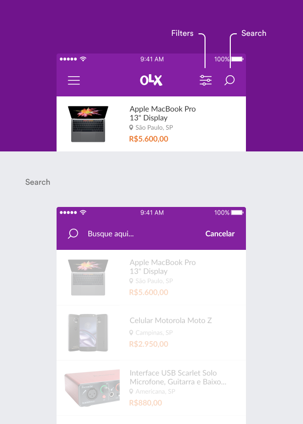
New search and filters
The first problem I tackle from the problem list was to redesign the search and filter experience. I moved the search filters into a separate screen and simplified the search into a simple top screen change.
Out with the old, in with the new
For the new profile screen, I used the color palette of tones of purple, created new custom made icons, and spaced the content a little more so each section has it's own place and focus area.
Improved sales ad
The old sales ad screen gets the job done but it also could be improved exponentially. I kept the same content structure and added category icons for the type of product, ad, and user photo.
Support ticket
It's hard to keep track of support tickets when there are thousands of people using an app and to try solving that problem I designed a simple support screen.
Support ticket
It's hard to keep track of support tickets when there are thousands of people using an app and to try solving that problem I designed a simple support screen.
Maybe you'll enjoy reading the article I wrote about the OLX redesign